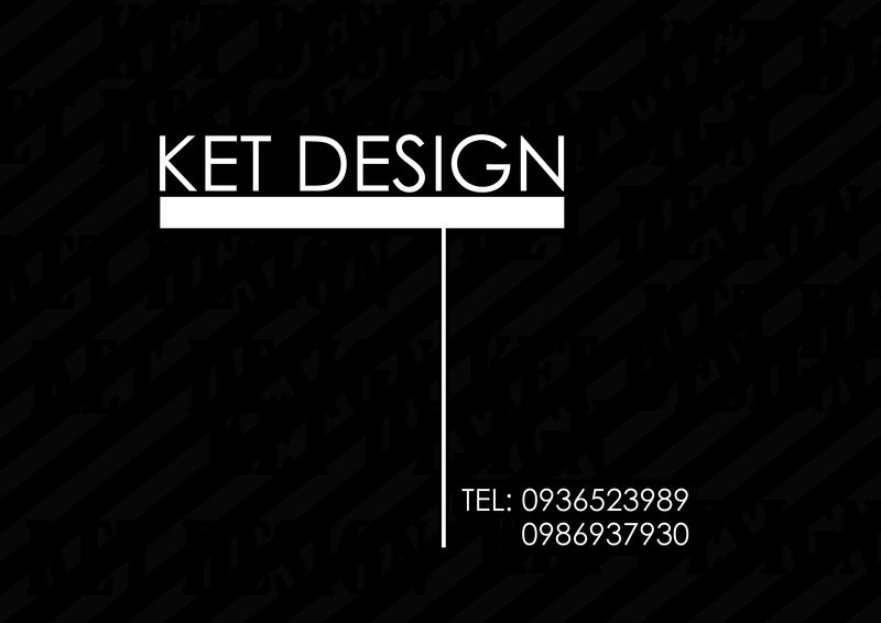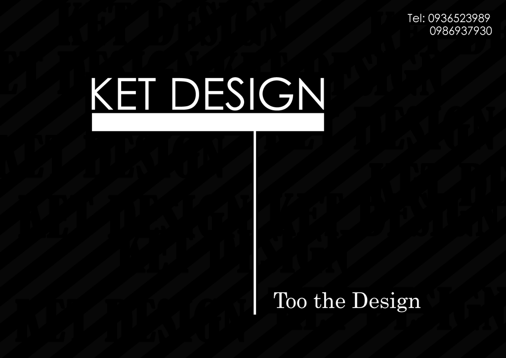

This is my 2 version of card visit which i made for my imaginary future design company. I tried to make it as simple as possible, as well as highlight the company name. I chose the font Century Gothic for the main text, which is simple and more straight forward .
1 nhận xét:
The first one is better. The 2nd one is kind of cheesy.
Đăng nhận xét