Chủ Nhật, 11 tháng 1, 2009

Memorial


This is a memorial token for a vietnamese student, Tang Quoc Binh, who was attacked in Russia. Binh is a brilliant student of Vietnam, and the cruelty of those who attacked him is unimaginably detestable. Binh can no longer talking, listening and studying like all of us here. His life may have stopped, but all of us here will never forget a brilliant son of mother Vietnam.
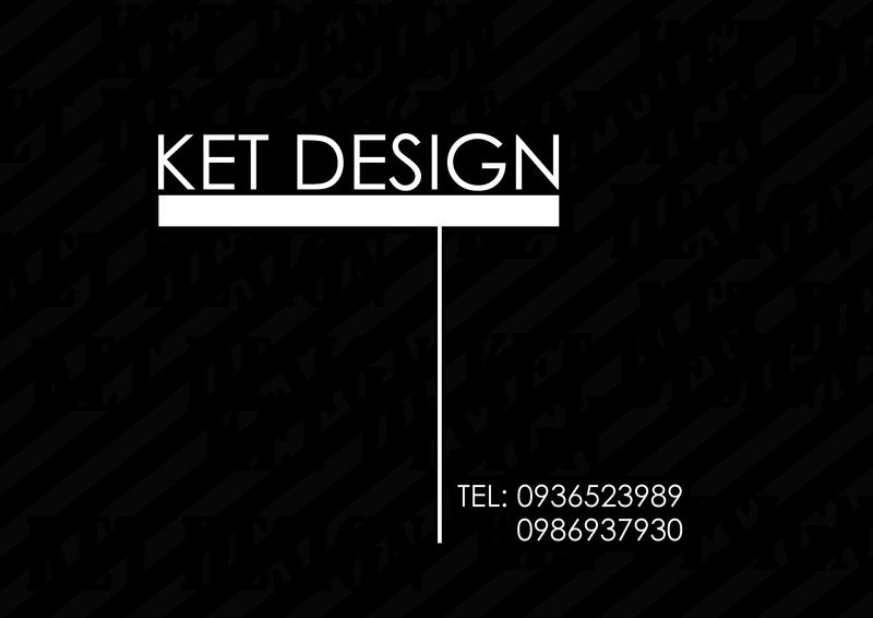
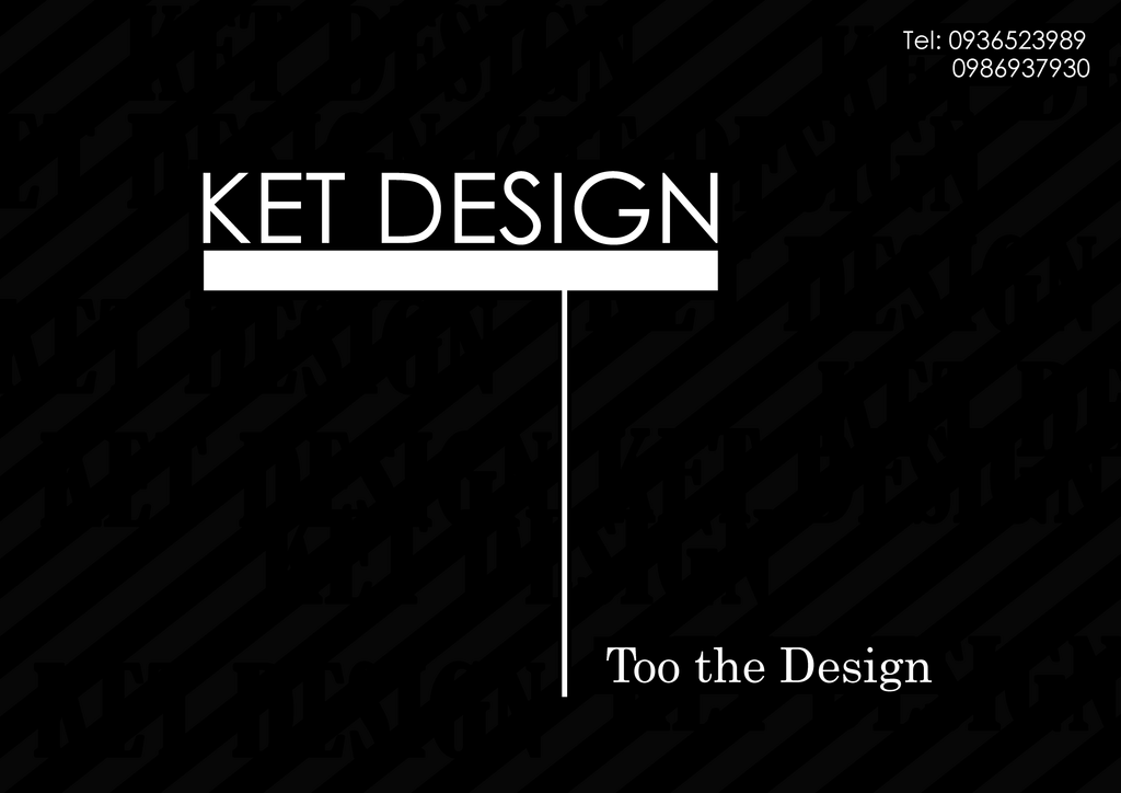
Card visit

card


Photobucket


This is my 2 version of card visit which i made for my imaginary future design company. I tried to make it as simple as possible, as well as highlight the company name. I chose the font Century Gothic for the main text, which is simple and more straight forward .

Chủ Nhật, 4 tháng 1, 2009

Camera

\


This is a photo of the camera LG KU990 which i have modified. I have tested several different illustrator brush sets and this is the result. It's not as i expected, the textures are messy and unorganized, there is no concept to the picture and some of the colours are quite off. My imagine picture should include a couple of more different textures which will be in cooperating well with the rest. Also, i can find it is quite difficult to seperate the camera image from a complicated background without losing quality. I'm trying to find a new way to solve the problem aside from using mask or extract.

Baskerville font

http://www.zshare.net/flash/536820266d347b61/


Above is my flash i made for the assignment 2C. My flash topic is a short advertisement about the Baskerville typeface. The font itself has a pretty long history, as well as a scarry road. In the flash, i have tried to create the atmosphere at that time through verious use of materials like classical song (Bach), symbols and old font types. I hope you enjoy it.

Chủ Nhật, 28 tháng 12, 2008

Icons


This is a set of icons which i made for the previous theme. These icons are randomly made based on the original Sony's icon set. Actually, it includes Games, Network, TV, Video, Photos, Settings and musics, but the Network and Settings will be added later. The game menu only contains a "G", which is simplified of games. I first intend to draw a big gamepad, but then i figure out it would be inappropriate since this is a console gamepad already. Therefore i chose to use only a G to materialize the meaning. Also, the video icon contains 2 eyes balls, which i made so that it can express the meaning of video fully.

PSP them


This is my new entry. It is all about the psp. Above is a theme used as background for my psp(portable play station). PSP is a game console, which is very small and contains many great games. I'm interested in making new themes for my psp. This theme has no meaning at all. It just consists of lots of breaking fragments and a space for icons. When i made this one, i got a very strong feeling for glasses and fragile things. Therefore i decide to make it look a lot scarry and stuff. In the next entry, i will put a set of icons i make for this theme.

Chủ Nhật, 21 tháng 12, 2008

New entry


This is my book cover for assignment 2b. I have created this after several attempt and retry. The front cover is somewhat simple. I didn't put any complicated materials in it. In my opinion, the front cover doesn't need to be complex. We can put the most simple image to describe certain things. The foot prints, in the original, has been changed to the shoes prints, to make it more effective. Also, in the back cover, i have completely changed the whole theme, which the previous one was, somehow blank and unprofessional. This new back cover was taken from the idea of gathering up many scrapped papers into one place, or the piece of the puzzle. Lastly, the typeface i used here is san-serif, which emphasizes the formality and the seriousness of this type of book.

P/s:I don't know why but the image's colours was awful. It only happens when i upload it into the blogspot server. I'm trying to solve it out.