Chủ Nhật, 28 tháng 12, 2008

Icons


This is a set of icons which i made for the previous theme. These icons are randomly made based on the original Sony's icon set. Actually, it includes Games, Network, TV, Video, Photos, Settings and musics, but the Network and Settings will be added later. The game menu only contains a "G", which is simplified of games. I first intend to draw a big gamepad, but then i figure out it would be inappropriate since this is a console gamepad already. Therefore i chose to use only a G to materialize the meaning. Also, the video icon contains 2 eyes balls, which i made so that it can express the meaning of video fully.

PSP them


This is my new entry. It is all about the psp. Above is a theme used as background for my psp(portable play station). PSP is a game console, which is very small and contains many great games. I'm interested in making new themes for my psp. This theme has no meaning at all. It just consists of lots of breaking fragments and a space for icons. When i made this one, i got a very strong feeling for glasses and fragile things. Therefore i decide to make it look a lot scarry and stuff. In the next entry, i will put a set of icons i make for this theme.

Chủ Nhật, 21 tháng 12, 2008

New entry


This is my book cover for assignment 2b. I have created this after several attempt and retry. The front cover is somewhat simple. I didn't put any complicated materials in it. In my opinion, the front cover doesn't need to be complex. We can put the most simple image to describe certain things. The foot prints, in the original, has been changed to the shoes prints, to make it more effective. Also, in the back cover, i have completely changed the whole theme, which the previous one was, somehow blank and unprofessional. This new back cover was taken from the idea of gathering up many scrapped papers into one place, or the piece of the puzzle. Lastly, the typeface i used here is san-serif, which emphasizes the formality and the seriousness of this type of book.

P/s:I don't know why but the image's colours was awful. It only happens when i upload it into the blogspot server. I'm trying to solve it out.

Chủ Nhật, 14 tháng 12, 2008

Night


This is my new entry. I named the picture above "City of the stars", which depicts a strong field of stars on the night sky. I used mask technique to blend 2 objects, which are the city and the night sky together. Although i tried my best, the city below doesn't blend very well with night sky. The city still looks like it comes from a fake bad comic. Probably this is due to the inappropriate light adjustment.

Chủ Nhật, 7 tháng 12, 2008

Montage


This is the montage work which i made for my assignment. The work itself is simple, with only 8 objects blend together to create the meaning i want to define. The main concept in this montage is "lonely". The picture of a man with his head down provides a very solitary feeling. The man looks lonely with just 1 candle and a gift on the single table in the room. The room is rather big, while the candle just barely light the room. The feeling itself is isolated. Beside, a family's old photo behind him is just half hanging, while it is in black and white. The man is single, and completely isolated. He doesn't have anything for himself, not even a relative left. He wants to give the gift for someone, but he doesn't have any. He himself was covered by the dark atmosphere in the corner of his own dream.

Face


Lately, i have been trying in blending and manipulating stuff. The picture above is a result of several attempts in creating a distort face. The original photo which i based on can be found here http://www.sxc.hu/photo/1113322 .
The concept behind this work is about the devastation of time, the abstract meaning of each part of a face. The original photo itself has been changed and recreated several times. The eyes were made from 2 screw objects while the mouth was replaced by a zip. We can see a real eye beyond the "mask". The face itself is like a real face as well as a mask wearing by the woman. It is like a barrier of lies and tricks to prevent the outside get in. The mouth was zipped and her mind was seal, she cannot communicate with the outside world and otherwise.

Chủ Nhật, 30 tháng 11, 2008

Help


This is an ancient exercise that existed ages ago. Now i will dig it up and redo it. Well, in truth, this is a practice for the assignment 2 which is coming up. The blending technique is applied here. I find that it is really useful to make object different from its original form. In this exercise, i do not repeat exactly what the tutorial said, but instead i try to make go other ways. The picture this time has a more of a horror feeling. I like horror, therefore i made it look like a horror movie. In fact, i attempted to make a horror movie poster. I even thought of a plot for this imaginary movie. The plot should star a female character who was trapped in the maze of her own mind. She tried to get out of all the illusions while seeking for help. In the picture, i only used clipping mask once time to make the the eyes blend in the background. I also added some blood, gore, and even some blood vessels on the eyes.

The "K"


This is the letter "K" i made for the exercise in the class. The idea behind this letter was when i came across the symbol of the Griffindor in the famous series Harry Potter. It was a Griffin, and then the Slytherin symbol, which was a snake. I took the idea of making the "K" looks like a three-head snake, or a Hydra- mythical creature in old stories. I decide this typeface you be serif, with the head and tail of the snake to be in bigger size than the rest. Althought the sketch was pretty good, the drawing on illustrator was not very good. I still can't use Pen as fluently as a real pencil paper.

Chủ Nhật, 16 tháng 11, 2008

Photo Edit

This week i have learned some new techniques which are mostly used in photo editing. Today i will experiment photo retouching method that i think is very impressive and adoptable to different occasions.
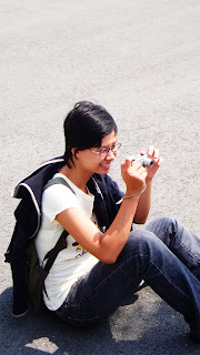
As we can see, below is a photo that i took of my friend, Van. She is very cute and smile very brightly.


I use Photoshop to add a thin white layer and make the photo become much better. Duplicate that source layer, then apply Filter->Gaussian Blur and adjust it to an appropriate amount depend on the size of the image.


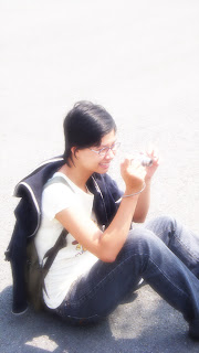
The above is the result of the first touching. We can see that the photo become much brighter and more sparkling.
Then we adjust the contrast a bit to make it more indepth using Adjustment->Brightness/Contrast and turn the contrast bar to max.
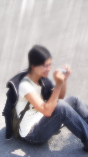
After that, to make it more glamorous, we can randomly add some shining rays of light to the photo using the following technique.
Create a new layer, then use Filter-> cloud then filter->Different cloud. Then we use Filter->Motion blur and adjust the direction of the blur the appropriate way. After that, we duplicate the layer to make it brighter. Then choose the blending option for the rays of light "Softlight"

The result is shown below


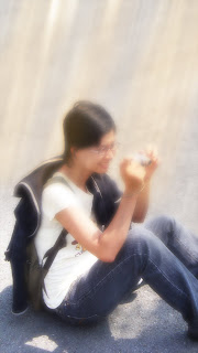
To make it even more sparkling, we can add some colours to the rays of light.
Make a new layer, then use a brush with big size and orange or yellow color to brush as follow the direction of the light. Then we apply "Softlight" blending option to it.

Below is the final version.


Practice 3

This week i continue with another practice. The picture below was made using photoshop. My inspiration came from 2 films "Lost in translation" and " The Da Vinci code". The wave of words in the picture describes the large amount of knowledge flows throughout the universe. It expresses an infinite source of knowledge and the desire to overcome even the vast space of human. When i made this picture, i had a feeling of faraway space, a distance and mysterious world. Somewhere out there, it should exist other entities, other form of life which we never know
I made this picture using the star field layer which i made and the wave of words using Filter->Wave. Other stuff was made using mostly Filter to add effects.


Chủ Nhật, 9 tháng 11, 2008

Practice 2

This is another practice for using Photoshop and Illustrator to create a live trace of human face.

The below is a portrait of my friend which i drawn. However, for some reason, it looks like a donkey more than a human. Whatever, we can see that the portrait is unclean and pale with lots of erased lines still exist. That's why we need to make similar trace version with it for higher quality purpose.


Firstly, I erased all the unnecessary part (unrelated to the portrait) . I found it easier to edit and modify the photo this way. Then i adjust level for and threshold to make the contras more vivid and reduce some noise occur. The result is shown below.


After that, i moved to illustrator to attempt the live trace tool. After using live trace, we can see the shape of the whole face change somehow. This is inconvenient, but it is to be expected since live trace is quick and all. One more thing unrelated to the process, that is i found the curves made by using the live trace are somewhat interesting and creative. It can be used as materials for producing new texture easily :D.


The last part, i used the Live paint bucket to colour the face. The below picture show the process of colouring.


As a result, i found that live trace is a very useful and convenient tool to make a quick and easy trace without taking a sweat. However, on the down side, live trace sometimes doesn't not produce the ideal result as it is still somewhat a "fast food" tool. Normal trace with hand and pen tool and zoom in zoom out is still the best and hard working trace tool produced. One more up side, live trace product can be used to up scale as much as possible without losing the quality.

Thứ Bảy, 8 tháng 11, 2008

Practice

During the last class. I had a chance to study the techniques using masks and clipping mask. The below is a small practice in using clipping mask to apply new texture to words. This also be used for images and photos.


My inspiration came from the font Showcard Gothic. When i saw the uneven lines in each words, i had an idea to remake those words using just circles.


The circle is kind of unequal and feel distanced. I tried to make it as precise as possible. This is just like tracing a picture.


Finally, i added some textures and using masks to apply the new texture to the words. The texture on top of each word was made using the filter cloud-> different cloud +filter fiber. It looks somehow weird and flammable.

Chủ Nhật, 2 tháng 11, 2008

Wallpaper

This is a wallpaper i made during my free time. It took very little time to do, so it may not look very good. However, i recently take an interest in creating objects based on 2 colors black and white. I like the idea of making small random objects and sticking them together, changing between black and white to make them appeal more on the background. Let's say this is a small experiment.


Gestalt exercise

This is the Layout for my Gestalt exercise. In this exercise, i use appropriate materials to illustrate the content "The Secret sex life of plants".
In the layout, i have expressed 2 ideas of closure and continuance.
+Proximity: The two text boxes which i placed closer to each other but in different line. The uneven text boxes also help to reduce the difficulty in reading to many words in a whole at once.
When looking at the total layout, we can easily spot 3 groups of objects. One is the title boxes group, other is the text boxes group and the flower picture group.
+Continuance: Normally, readers read texts from left to right and from above to bottom . Therefore, this will help them easier to read and revise after reading. Also, it helps increase the reading speed and reduce confusion in reading texts.


Chủ Nhật, 26 tháng 10, 2008

This is a side-job exercise i made during the last semester break. The purpose for this panel is to advertise for the C.N.C machine, the first Vietnamese C.N.C. Our group includes Van and me have brainstorm . Then we came up with 4 different layouts. In the end, we chose the below design. The design's main idea is to emphasize the symbol-C.N.C. The logo Tamsanh is on the top left corner of the panel. It took 4 different pictures to extract and stick in the main background.
Actually, the beta picture has more style than this one. But our client require more places to write phone number, address and stuff... So we had to change the original idea a bit. The redesigned panel has been made by Van and me in 3 hours. This is due to a change in the last minute of our harsh customer. He prefer to change the whole thing into something better despite the fact that the printing date is near.

Source:

http://www.flickr.com/photos/vieira/190362174/sizes/o/

190362174_ad783d28d8_o

http://www.sxc.hu/photo/957144


Sun and moon

This is my first exercise which has been given to me in this third semester. The basics for this exercise is to develop the ability to think and create a chain of process in order to complete a designing mindset. After a period of time brainstorming and bringing my imagination to materialize. I have come up with two design of the sun and moon. Each of them has a distinctive feeling and idea.


The picture above is the first design that i thought of. The sun and moon in this picture has been changed and de-shaped. My first inspiration comes from the shapes that i have been reading on the net. There is a recolonization that the circle, triangle and rectangle symbolize certain meanings. As described, in this picture, the large yellow rectangle symbolizes the sun, while the triangle symbolizes the moon. Why do i use those shapes ? It is simply because i see that the sun and moon have a irregular similarity to the shape of rectangle and triangle. And the color for each emphasize their characteristics. The sun shines brightly, which has a hotwyellow, while the moon, which appears at night, has a night-black color.


The second picture is a bit weird. Firstly, i came across a photoshop tutorial in which they taught how to make an eye. After that, i thought if we place the eye in an eclipse moon, i can make it more inspire and distinctive. The theme is black in order to emphasize the strange picture. This design is a bit extreme and horror-style.